When it comes to commercial painting, most businesses focus on durability, maintenance, and cost. However, one factor often overlooked is the psychological impact of color. The truth is, your walls are doing a lot more talking than you might think. Whether you run a bustling retail store, a high-powered corporate office, or a welcoming healthcare facility, the colors you choose during your commercial painting project send powerful subconscious messages to employees, clients, and visitors alike.
Understanding the principles of color psychology can turn your commercial painting investment into a strategic tool that enhances mood, encourages productivity, and even drives sales.
The Psychology Behind Color Choices in Commercial Spaces
Commercial painting is not just about aesthetic appeal—it’s about creating an environment that supports your business goals. Research shows that color can influence emotions, decision-making, and even physical responses. For example, warm tones like red and orange stimulate excitement and appetite, making them ideal for restaurants and entertainment venues. In contrast, cool tones like blue and green tend to promote calmness and focus, which is why they’re often seen in offices and healthcare settings.
Before diving into a commercial painting project, it’s crucial to ask yourself: what atmosphere do you want to create? The answer should guide not just your brand colors but also the subtle accents that tie the whole environment together.
Choosing the Right Colors for Different Business Types
The art of commercial painting lies in tailoring color choices to fit the specific goals of your business. Let’s explore how color psychology plays out across different industries.
Corporate Offices
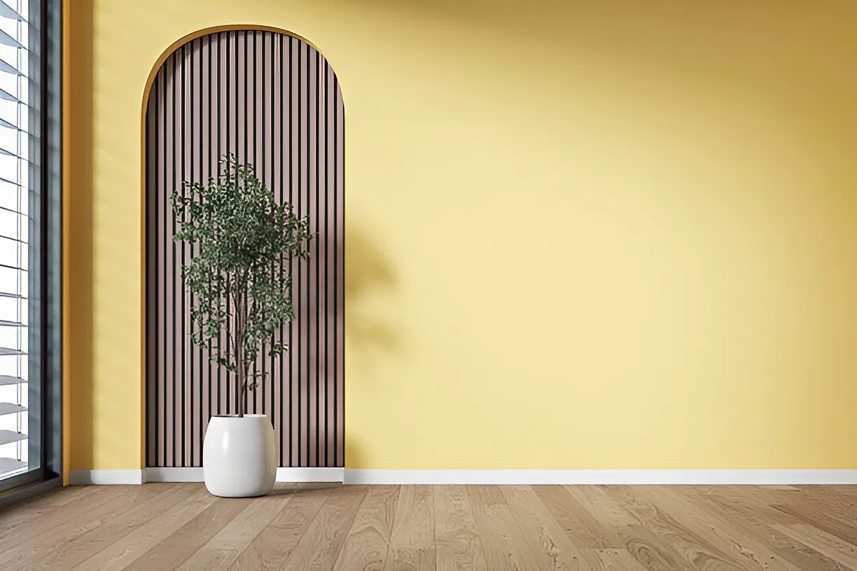
In a corporate environment, commercial painting decisions should support focus, productivity, and professionalism. Blues, greys, and neutrals dominate these spaces because they foster trust and stability. A hint of green can reduce eye strain and boost efficiency in high-stress roles. If creativity is a priority, splashes of yellow can spark innovation, but it’s important not to overwhelm the space.
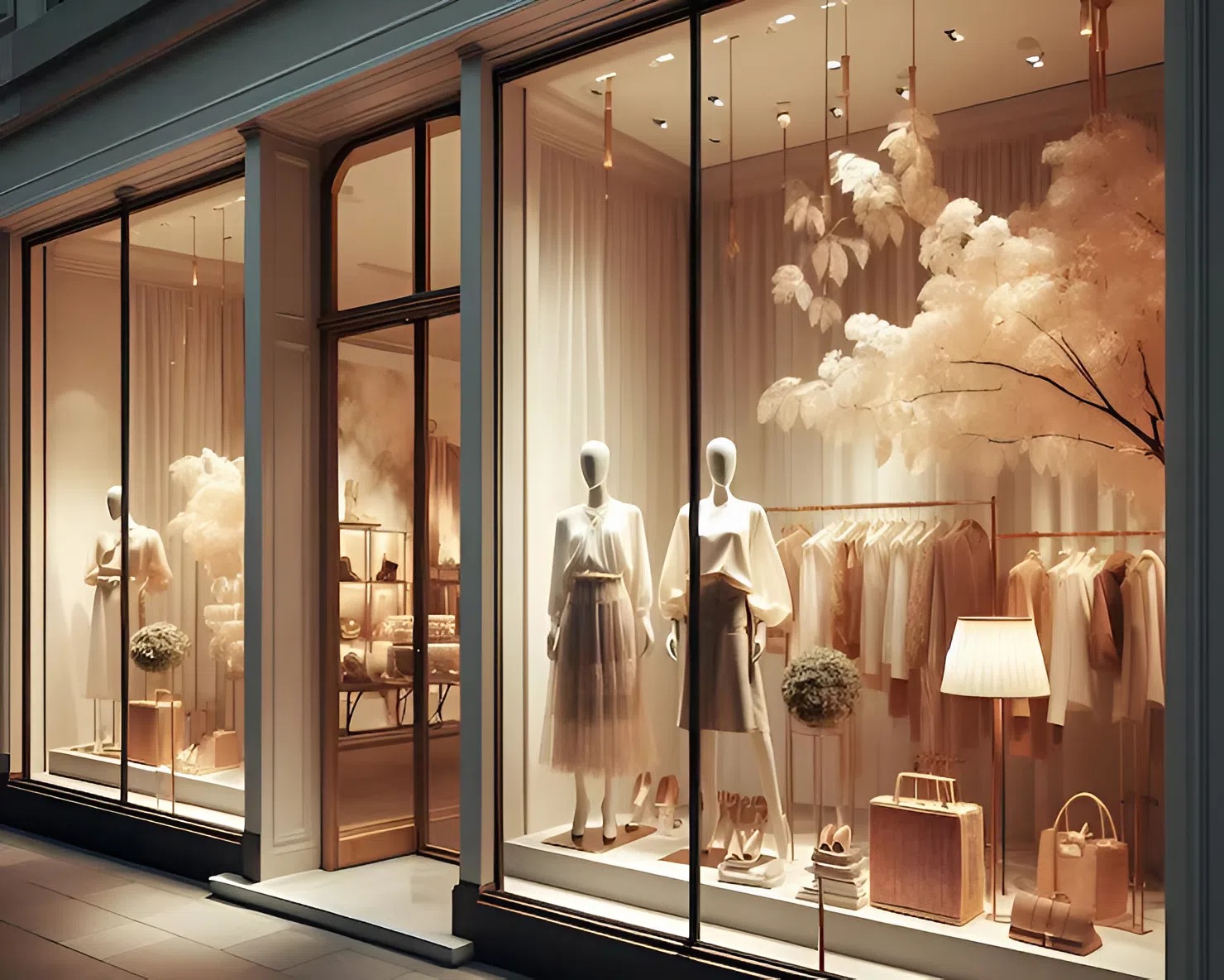
Retail Stores
Retail businesses rely heavily on emotional responses to drive purchasing behavior. Commercial painting for retail often leans into vibrant and energetic tones. Red is known to create urgency and is commonly used in clearance sales, while yellow evokes optimism and draws attention. Black, when used strategically, can communicate sophistication and luxury. Balancing bold accent walls with neutral backdrops ensures that products, not just the walls, remain the focal point.
Healthcare Facilities
When approaching commercial painting for healthcare settings, the focus shifts to comfort, calm, and reassurance. Soft blues, gentle greens, and muted earth tones help lower anxiety levels and promote healing. Stark whites, while clean, can sometimes feel too clinical; warming them up with gentle undertones can make a major difference in patient experience.
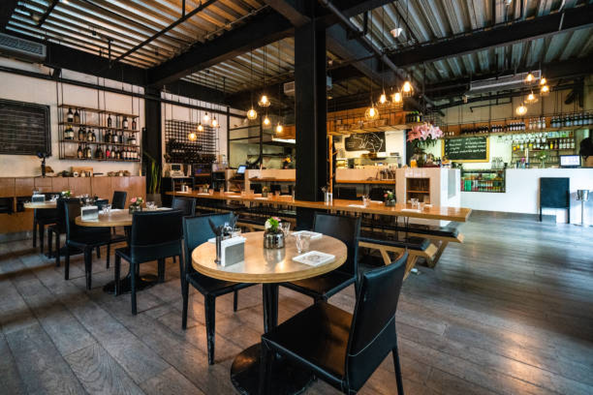
Restaurants and Hospitality
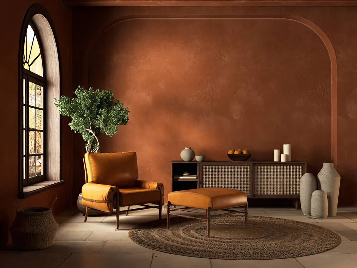
Restaurants and hotels thrive on ambiance. Through commercial painting, you can subtly influence how long guests stay and how much they spend. Warm colors like terracotta, mustard, and burgundy stimulate appetite and encourage lively conversation, perfect for bustling bistros. Meanwhile, elegant shades like navy, deep plum, and charcoal create a more intimate, upscale atmosphere for fine dining or boutique hotels.
Trends in Commercial Painting and What They Signal
While personalizing your business space with the right painting techniques is important, staying aware of current commercial painting trends ensures your space feels contemporary and appealing. Lately, earthy tones, rich greens, and sustainable palettes have gained popularity, signaling environmental awareness and authenticity. Soft pinks and sophisticated beiges are also making a comeback, suggesting warmth and modern hospitality.
Even minimalist styles benefit from strategic commercial painting. An all-white office punctuated with colorful doors or a monochromatic restaurant with a bold ceiling can leave a lasting impression without overwhelming the senses.
Why Strategic Commercial Painting Pays Off
Investing in thoughtful commercial painting isn’t just about creating an attractive space—it’s about optimizing the human experience within it. Whether you’re trying to foster loyalty, boost employee morale, or entice shoppers to stay longer, the right color choices can be a silent partner in your success.
Moreover, a fresh commercial painting job signals that you care about your environment and brand presentation. It shows that you’re modern, attentive to detail, and invested in both aesthetics and functionality. For employees, it means a more pleasant workspace; for clients and customers, it means a space where they feel comfortable, energized, and connected to your brand.
Commercial painting is one of the few business investments that offers both tangible and intangible returns. It enhances property value, strengthens brand identity, and most importantly, shapes the way people feel when they walk through your doors.
If you’re ready to elevate your business with strategic commercial painting, working with an expert team ensures that every brushstroke aligns with your brand’s mission and vision. Your walls are talking—make sure they’re saying exactly what you want.
Choose Painting by Jen for Expert Commercial Painting Services in Ankeny, IA
Ready to transform your space and make a lasting impression? Choose Painting by Jen for expert commercial painting services in Ankeny, IA. Our team understands the power of color and craftsmanship, delivering flawless results that elevate your brand and create the perfect atmosphere for your business.
Contact us today to schedule your consultation, and let’s bring your vision to life!