When it comes to retail, first impressions aren’t just important—they’re everything. From the moment a customer steps through your doors, the atmosphere you create can influence how long they stay, how they feel, and whether they make a purchase. One of the most overlooked yet powerful tools in curating that atmosphere is your choice of interior paint colors. Color doesn’t just fill a space; it drives emotion, perception, and even spending habits.
The Psychology Behind Interior Paint Colors
Color psychology plays a critical role in retail design. Certain hues can evoke calmness, while others create urgency. For instance, cool interior paint colors like soft blues and greens tend to relax customers, making them ideal for wellness stores or boutiques. On the other hand, bold tones like red or orange can stimulate excitement and appetite, perfect for food retail or high-energy brands.
Understanding how your target customer reacts to specific interior paint colors helps you create a more aligned and effective shopping environment. The color of your walls isn’t just decoration—it’s a strategic decision that can influence mood and buying behavior.
Choosing Interior Paint Colors Based on Store Type
Different retail sectors require different emotional tones. A luxury clothing store may opt for muted, elegant interior paint colors such as taupe, charcoal, or soft ivory to create a sense of exclusivity and sophistication. Meanwhile, a children’s toy store might lean into vibrant primary colors to foster fun and stimulation.
For tech retailers, clean and modern interior paint colors like white, steel grey, or deep navy can emphasize innovation and sleekness. These choices subtly shape brand identity and reinforce the kind of shopping experience you want your customers to have.
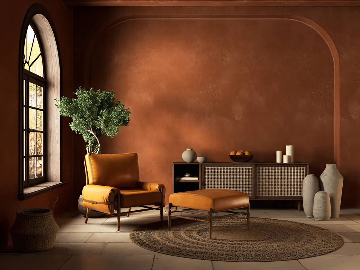
Trends in Interior Paint Colors for 2025
Earth-Toned Interior Paint Colors Reflecting Sustainability
As we move further into the decade, interior paint colors inspired by nature are dominating retail design. Earth tones like sage green, terracotta, and warm sand are particularly popular. These colors communicate a grounded, eco-conscious message that resonates with today’s shoppers, especially in wellness, organic, and lifestyle brands. Earthy interior paint colors not only create a calm and welcoming space but also align with broader trends toward sustainability and authenticity.
Muted Pastels for a Soft, Sophisticated Feel
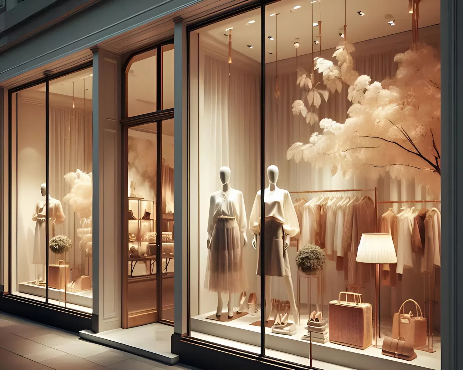
Muted pastels are another rising trend in interior paint colors for retail spaces. Blush pink, dusty lavender, and pale mint create a soft, sophisticated backdrop that appeals to boutique shoppers looking for a curated, elevated experience. These tones work especially well in smaller stores where intimacy and detail matter. When used strategically, pastel interior paint colors can evoke both comfort and luxury.
High-Contrast Interior Paint Colors in Minimalist Stores
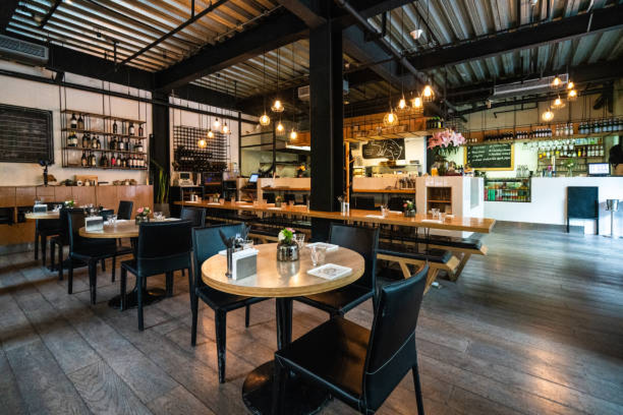
Minimalist brands continue to favor sharp, high-contrast interior paint colors such as black and white or charcoal and cream. These timeless combinations project clarity, control, and modernity—perfect for tech retailers, high-end fashion, and concept stores. When paired with industrial materials like steel or concrete, these interior paint colors help create a sleek, cutting-edge environment that emphasizes the product above all else.
Interior Paint Colors That Increase Dwell Time
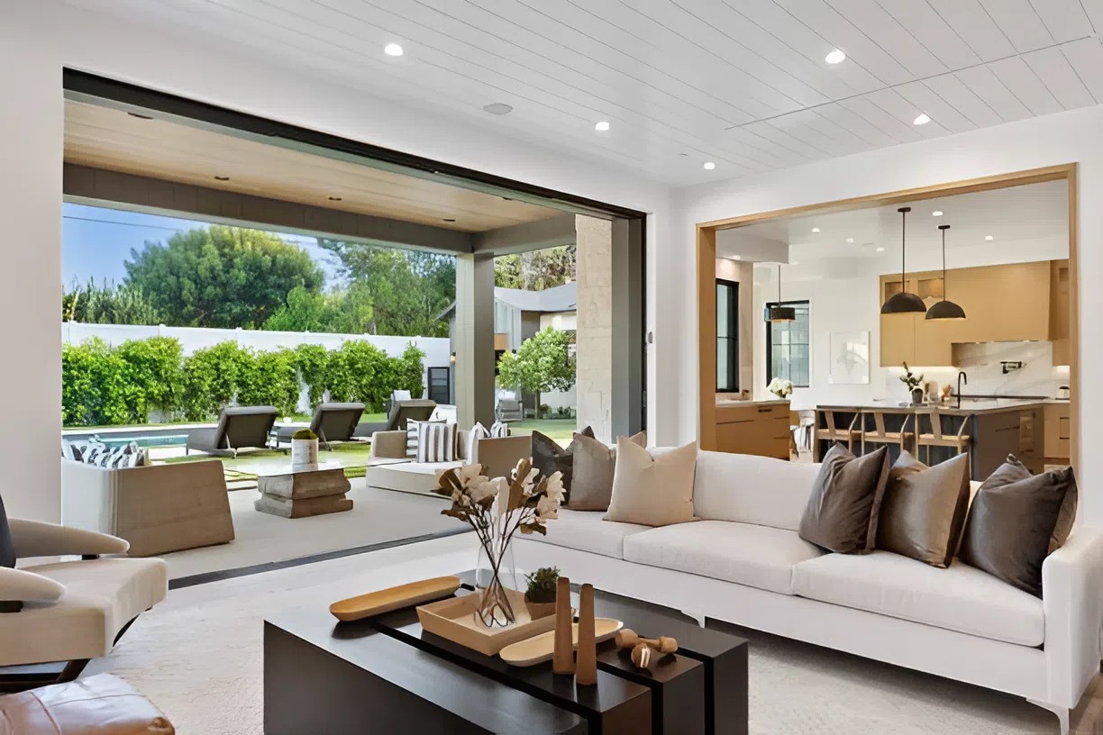
The longer a customer stays in your store, the higher the likelihood of a purchase. Soft neutral interior paint colors like beige, light grey, and cream promote comfort and calm, encouraging customers to browse without feeling rushed. These shades act as a subtle background that allows products to stand out, especially in stores where product rotation and seasonal merchandising are frequent.
Using painting techniques like a cohesive palette that aligns with your brand and merchandising can enhance the customer experience while increasing dwell time and ultimately driving sales.
How Lighting Impacts Your Interior Paint Colors
It’s not just the paint you choose, but how it interacts with light. Natural lighting enhances warm and soft tones, while artificial lighting can distort certain interior paint colors. Always test samples in your actual retail space, under your exact lighting conditions, before making a final decision. A color that looks crisp and clean in a sample booklet might appear dull or harsh under fluorescent lighting.
Every square foot of your retail space is an opportunity to tell your brand story, and interior paint colors are one of the most cost-effective yet powerful tools at your disposal. Whether you want to energize, relax, or impress your customers, there is a palette that can help you get there.
By aligning your interior paint colors with your brand identity, customer psychology, and sales goals, you’re not just painting walls—you’re shaping a shopper’s entire experience. Choose with intention, and you’ll create an environment that not only looks good but sells well, too.
Choose Painting by Jen for Expert Commercial Painting in Ankeny, IA
Ready to transform your retail space into a shopping experience that truly sells? Painting by Jen brings expert commercial painting services to businesses across Ankeny, IA, helping you choose the perfect interior paint colors that reflect your brand and captivate your customers. Whether you’re going for bold, modern, or calming vibes, our team ensures a flawless finish that leaves a lasting impression. Let’s create a space that moves products and people—contact us today for your commercial painting consultation.